The Iron Curtain. That was a term I heard often as a kid growing up in the Cold War ’60s. What exactly was this metallic barrier, and who or what was behind it, I wondered. Little did I know back then that British Prime Minster Winston Churchill had coined the term to refer to the ideological barrier that separated the free world from the Communist world. But in time, I came to realize that an actual curtain really did exist – one made of concrete. It was called the Berlin Wall, and it held much fascination for me.
 By the time I first set foot in Berlin in 1993, there was virtually nothing left of the monolith that separated the two parts of the city between August 13, 1961, and November 9, 1989. I was expecting to see something of the 97-mile-long structure that was born at roughly the same time as I. Still, I understood the need to destroy this ugly reminder of socio-political oppression.
My first order of business was a trip to the famous Checkpoint Charlie area to buy up as much memorabilia as I could: from silly touristy things like a tiny chunk of the demolished wall, tastefully encased in plastic (whether it’s authentic or not, it’s on my kitchen wall!), to books detailing the history of the barrier and the incredible stories of East Germans who carried out elaborate schemes to scale or burrow under the wall (at least 136 people died trying to cross the border). But my favorite souvenir is a book that features the incredible amateur graffiti that once adorned the western side of the wall, as well as the more professional paintings that cover the structure’s few remaining remnants.
The most famous of these graffiti images is a painting based on a 1979 photograph of Soviet leader Leonid Brezhnev planting a big wet kiss on the lips of East German President Erich Honnecker during a celebration to mark the 30th anniversary of the formation of the Deutsche Demokratische Republik (the Communist-ruled German Democratic Republic, or DDR). French photographer Régis Bossu snapped the original image, perfectly capturing the creepy lip-lock of the Commie brothers. The photograph was an immediate media hit, published in newspapers around the globe. French magazine Paris Match named the photo “The Kiss,” and devoted a two-page spread to the picture. A German telecommunications firm even used the photo in advertising posters without permission. (Bossu filled a lawsuit and won.)
 In 1990, with the euphoria of German reunification at its peak, Russian painter Dimitri Vrubel discovered Bossu’s photo and decided to paint a version of it on a remnant of the wall that was still standing in East Berlin. He added the caption, “God help me to survive this deadly love affair.” His work became one of the most photographed graffiti images of all time, and was reproduced on everything from t-shirts to towels. The East-Side Hotel in Berlin even used the image in its logo.
Vrubel’s painting was the key attraction of what came to be known as the East Side Gallery – a 1,000-foot-long section of remaining wall which runs parallel to the Spree River. Through the years, 117 artists from 21 countries have displayed their work on this once controversial canvas. The stretch of wall – considered the largest open air gallery in the world – is a major tourist attraction. It’s been protected by a preservation order since 1993. But vandalism and bad weather eventually took their toll; the artwork – much of which was created using cheap paint – slowly deteriorated.
 In 2009, the East Side Gallery launched a major overhaul of the art wall. They removed the faded paintings using steam, and invited the original artists to repaint their sections. Vrubel was offered $4,000 to recreate his “Fraternal Kiss.” He donated the money to a social art project.
And while poor old Bossu never got rich from his shot seen ’round the world, he does garner a small, steady income every time his photo is published — which, to date, has amounted to over 500 times! He and Dimitri Vrubel finally met in 2009, when Bossu was invited to Berlin to exhibit his photos at the East-Side Hotel.
The fall of the Berlin wall was the most significant world event that occurred in my lifetime. As I watched the televised scenes of ecstatic people chiseling away at the wall with pickaxes on November 9, 1989, I never imagined that one by one the countries of the Soviet empire would soon be independent, or that I would spend the majority of my next five years immersed in the culture, history, and media landscapes of those fascinating regions.
Most of the Berlin Wall art panels have been removed and only exist in places such as Potsdamer Platz, Mühlenstrasse, and Bernauer Strasse. A few original remnants reside in museums. I took these photos: first, at the Centre de Commerce mondial in Montréal (in the “underground city”), and second, at the Newseum in Washington, DC. The third photos shows a wall section from the John F. Kennedy library in Boston. Click here to read more about art from the Berlin Wall.


© Dana Spiardi, Nov 9, 2014
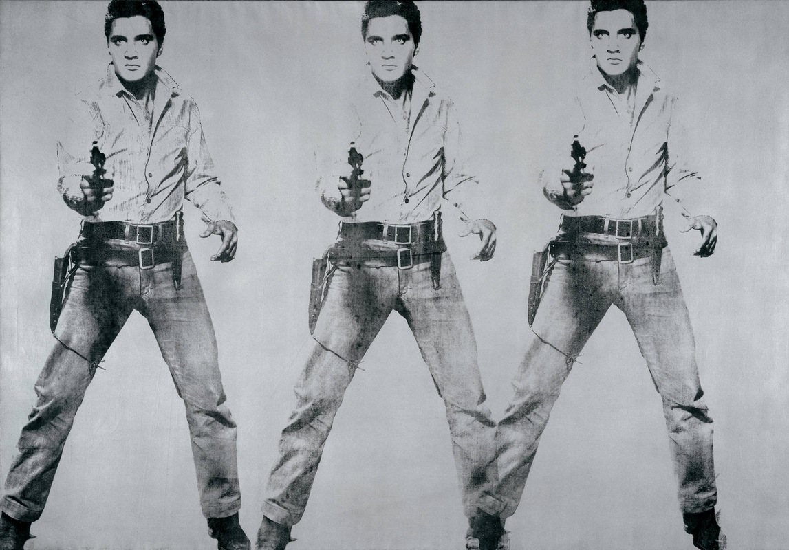
Here’s one of my favorite works of art: Andy Warhol’s Elvis. It’s based on a publicity shot for Presley’s 1960 movie “Flaming Star.” This piece is one of a series of screenprinted Elvis paintings Andy created in 1963. The biggest is at The Andy Warhol Museum in Pittsburgh. It’s 36 feet long, 6.5 feet high and features 11 Elvises. Magnificent!
Music writer Peter Guralnick penned two excellent books about Elvis: “Last Train to Memphis – The Rise of Elvis Presley,” and “Careless Love – The Unmaking of Elvis Presley.” I Highly recommend them. There was a lot more to The King than you might imagine. In addition to being an enormous talent, he was intelligent, kind, and compassionate. Sure, he didn’t invent R&B wailing and fancy legwork – he copied much of that from the Southern black artists he loved – but he had the smarts to repackage it and the moxie to present it to a white audience trapped in an era of conformity and conservatism. RIP, Elvis!
Wow, I’m going to art school. Just like John and Keith and Freddie and Bowie! Getting accepted was easy enough. As a casual student with no dreams of actually obtaining a degree, all I needed was a Visa card number. No portfolio, no reference letters, no transcripts. I was free to learn and have fun!
Of course, the best part of starting a new school term is planning what to wear. I attempted to look the part of a tragically hip art student by wearing my black-and-white camo pants and an Avirex t-shirt topped with a fisherman’s vest purchased in a Tokyo thrift shop. For accessories, I chose my typewriter-key earrings, a bracelet made from rolled-up comic strips, and my Harajuku Swatch (with the phrase Orientalmagicity Tokyo, it’sabrassring, apieceofcake, howfan-fu**ing-tastic! printed on the inside of the band). Sort of a radical Fab2K update of my ’70s college look (which consisted of a variety of glam-rock influenced platform shoes that I wore through rain, snow, and sleet).
I even applied extra coats of Banana Boat self-tanning lotion the night before so that I would have that spring break college-chick look. But I was no match for the real Art Student. First, I don’t have a single piercing on any part of my body other than my ear lobes. Second, I’ve never looked good in any of the RGB, CMYK, or Pantone hair colors favored by the true Bohemians. And third, it was just too hot a day to wrap myself from head to toe in Gothic black. But that’s okay. Being different is good, especially in art school.
The students I encountered were very friendly and made a new gal feel right at home. Classmates were eager to help the old student re-boot her computer, unzip her files, and control-click her shortcuts.
 At lunchtime I shared a table with two teenaged girls, Kim and Kristen. Kim asked me if I was enjoying school. “Very much,” I replied between large mouthfuls of a sandwich the Art Institute calls a Po’ Boy (I guess it’s the local version of the famous Louisiana treat, Pittsburgh-ized with Isaly’s chip-chopped ham). In going with the flow, I said to Kim, “What’s your major?” “Interior design,” she replied.
I half-jokingly asked if her course work included a class in Feng Shui. Kim blushed, saying she’d never heard of Feng Shui. Relishing this opportunity to mentor a younger student, I said, “Well, you know how sometimes when you walk into a room and you feel like throwing up? Well, that’s because your furniture’s horoscope signs are incompatible, your duct work is in retrograde, and your windows are in the yin position instead of the yang position. Result: bad Feng Shui.” Kim assured me she’d look into it.
Oh, you’re probably wondering about my course work. For the next 12 weeks I’ll be learning how to draw and design on the computer and also how to import images and manipulate them. Adobe Illustrator and Adobe Photoshop. More software. More expensive Mac hardware. A new scanner and something called a Firewire. Zip disks, too. More stuff. More money. All for the sake of shameless self-promotion projects.
© Dana Spiardi, July 3, 2000
Die Nasty. Dream Orphans. Beat My Guest. Highway to Heck. No, these aren’t names of punk rock groups or titles of angst-ridden, teen-penned poems. They’re names of fonts. Four evocatively named fonts that co-exist among the hundreds of others in my Mac. Fonts that compete on a daily basis to be chosen for use in one of my literary or graphic masterpieces (ahem).
I’ve rarely met a font I didn’t fall in love with. I’ve cruised the Internet super highways by night, luring new fonts to my harem. I’ve risked system contamination, blindly downloading free fonts from fly-by-night sites with seedy names like FontLust.com. Rogue fonts now reside alongside legitimate fonts that automatically enter the neighborhood every time I install new publishing software. Ah, but this indiscriminate font love now poses a major digital dilemma: I simply have more fonts than I can fathom.
Before Apple introduced OS X, with its easy-to-use Font Book management tool, maintaining large font collections was somewhat tricky. I was warned that my obsessive accumulation of font families would suffocate my operating system. This led me to purchase Font Reserve, an application that was highly rated as one of the best font management tools on the market. Font Reserve allowed me to activate only those font groups that I was currently interested in using, thus reducing the risk of font overload on the system.
When I upgraded to iLife ’04 in 2003, I was thrilled to see that its Font Book application could perform the same functions as Font Reserve. Plus, with Font Book, all of my fonts could be active at the same time!
I established categories within Font Book, organizing my darlings into groups such as modern, classic, outline, space age, scary, ethnic, bold, novelty, curly and old-fashioned. This has taken a lot of time, and I still haven’t categorized most of the newest font additions. And, although the WYSIWYG feature works when I’m using MS Word, it doesn’t apply in Photoshop or any of the other Adobe programs!
Perhaps it’s time to purchase a more powerful font management application. An April 2005 article in MacWorld.com states: “Thanks to OS X 10.3’s Font Book, most Mac users don’t need to buy a font management program. But if you have tons of fonts, share a font library with others, or have lots of fonts flowing through your system (from clients or collaborators, for example) you’ll need more features than Font Book offers.” The article reviews: Font Agent Pro 3.0 – four mice; Font Doctor 7.0 – four mice; and Master Juggler 3.0.3 – two mice.
A March 2007 MacWorld.com article reviews Suitcase Fusion, a font manager that “combines the best of Suitcase X1 and Font Reserve 3.” MacWorld gives this application a four-and-half mice rating.
Once again I’m faced with a major decision: buy new software or learn to live with what I have? The intelligent choice is to apply the tenets of a 12-step program to my font addiction, exercise some self-control, and start deleting fonts from the system. Only time will tell if Relish Gargler, A Yummy Apology, and Tibetan Beefgarden survive the cut!
]]>